Search ETFtracker
Please note that this search feature is new and may refer to pages on ETFtracker that have been consolidated or removed. This only effects the Pages results not the blog or forum.
101 items found for ""
- Active vs Passive - A closer look
Another important topic in the ETF investing space is understanding the differences between the passive and active versions of ETFs. There are a variety of differences between active and passive ETFs and if investors buy into them blindly, without understanding at least some of the differences, they could be exposing themselves to unintended risks. Disclaimer: This article does not advocate for one type over the other. They both have their benefits and can coexist within a portfolio. For any sort of investing advice, please do your own homework and consult with a financial adviser if you have one. What is an Active vs Passive ETF? The most common ETFs are passive and they are constructed to follow an index. The holdings within these ETF portfolios are updated at regular intervals (e.g. quarterly) and they also tend to follow buy-and-hold trading strategies as they seek to replicate the returns of the indices they follow. Active ETFs, as the name implies, have fund managers at ETF issuers who actively manage the composition changes of these ETFs. What are some of the differences? Passive outperforms Active but not everywhere Whilst it’s typically cited that passive outperforms active investing, it’s not true for every fund manager and it’s also not true for all sector types. The ASX distinguishes between funds which are index-tracking and those which are not. Using this information along with the knowledge that all Chi-X funds are actively managed we can compare performance. As we can see below, there are ETF categories where non-index tracking ETFs have outperformed when we look at monthly returns going back to 2019. The past performance does not guarantee future returns but it is worth comparing. Note: the groups shown here are a consolidation of the listed ETF categories shown by the ASX and Chi-X where the various Australian ETF categories (e.g. Australia, Australia Sectors, Australia Small/Mid cap) are grouped into 1 larger sector. For the purpose of timing for this article, a baseline level of growth was not added but analysis of this nature can be added in future articles. Some ETFs not as diversified as you think Diversification certainly is in the eye of the beholder but some passive ETFs might not be as diversified as you think. Recently, I did some analysis (Digging Deeper into ETF Holdings) that showed the average weight across the top 10 holdings of ETFs that share holdings data (156 of them) was 44%. This is across an average of 7.4 holdings. Passive ETFs can offer lower cost diversification than active but if you don’t look at the data you may not be as diversified as you think. Varying levels of transparency across different ETF types As above, passive ETFs offer a better view into what their underlying holdings than active. The latter does provide holdings data but on a delayed basis (e.g. quarterly). This is fair since the composition of these portfolios is the fund managers IP (intellectual property) and full transparency would not make much sense for them. Access to ETF holdings can be gained through looking at ETF issuer websites and downloading PCF statements. Some information is also on Yahoo Finance (but only top 10 holdings) whilst other, paid services, offer more insights. Lower fees, but lower potential returns Passive ETFs have lower costs than active ETFS (as can be seen via their MER or Management Expense Ratio) but, passive ETFs are built to track an index, not outperform it (as seen above in our performance section). Whilst not all active ETFs outperformed their benchmarks, they are less restricted on performance as their mandate is not simply to track an index. Valuation and Exposure risks Passive ETFs have more potential to be exposed to negative valuation risks than active ETFs. This occurs when they have to follow a particular holding change in an index they follow such as when ETFs following the S&P 500 had to adjust for Tesla being added to that index. Active ETFs have more manoeuvrability to avoid this if they choose. Furthermore, passive ETFs are less able to adjust to changing market phenomena such as rising interest rates or the changing tide going against the technology sectors. Active ETFs give investors access to fund managers who can navigate these sorts of market headwinds. Passive ETFs, due to needing to track indices they follow, can lead to investors needing to make more direct portfolio decisions themselves. When market issues arise, an advantage of active ETFs is that they can also hold cash to manage the overall risk of the portfolio whereas passive funds are less able to take advantage of such opportunities. Liquidity risks Liquidity refers to the ability to quickly and easily buy and sell a security. If a security cannot be sold easily, then it is considered illiquid. ETFs are a popular investment vehicle as they offer access to diversified, fund-like performance but are more liquid as they trade on exchanges. We can see some signs of ETF liquidity in the bid-ask spread where tighter bid-ask spreads often signal more liquidity and wider spreads can mean less liquidity. ETFs are often considered similar to stocks but in doing so it is wrong to assume that trading volumes are proxies for liquidity. Whilst stocks can have fixed volumes in circulation, ETFs (through creation, redemption mechanism) have their liquidity mainly affixed to the liquidity of the underlying holdings that make up the ETF. This means that an ETF that has low volumes can actually be highly liquid, and vice-versa. ETF liquidity issues were on show in a recent article by the Financial Times ("Concerns grow over ETFs’ illiquid holdings"). They talk about how, when market sell-offs occur, illiquid ETFs can be prone to being sold far lower than the current market prices indicate. Also, due to retail investors being far less privy to the liquidity of the underlying holdings of an ETF (as they have less access to data and tools that institutional traders have), they are far more prone to liquidity risk when buying ETFs. Factset, the financial data firm, developed a methodology of flagging ETFs with liquidity issues by looking at how much a 5% sell-off in an ETFs FUM would equate in terms of the average daily volume of that ETF. What they found was a high underlying volume per unit figure indicates an adverse price impact is more likely, particularly with funds that hold outsized positions in less liquid markets. In the example they looked at the iShares Global Clean Energy ETF. If investors sold out enough to drive redemptions to 5 per cent of AUM, the necessary portfolio trades would equal 36.44 per cent of their recent median trading volumes. Across Australian ETFs, passive/index tracking ETFs have shown to have lower liquidity than their active ETF brethren. Correlation risks Both active and passive ETFs can lead to correlation related risks for investors. If multiple ETFs are held in a portfolio and the underlying holdings are replicated across those ETFs (e.g. there is a high level of similarity across those ETFs), then investors may be paying more fees for the same level of performance (depending on the weightings of those holdings. Within an individual ETF, if the holdings have shown strong levels of correlation, this can remove the positive effects of diversification that one would expect from an ETF. Investors with access to ETF ratings that showcase these correlation statistics may choose to find other ETFs with less correlated holdings but for investors without this information, they may miss out. Correlation comparing ETF vs ETF performance is also something to be mindful of. It's unlikely that an investor will buy both the IOZ and STW ETFs as they both track the ASX 200 but buying a core fund (like IOZ and STW) along with a more sustainable fund like FAIR could be something an investor does not think twice about as they appear in different categories and have different goals. However, FAIR and STW are 93% correlated (when looking at their 1-month returns since 2018 - see below). In this case, an investor would be paying extra transaction and management fees for similar returns, effectively reducing their own potential returns. Other Active vs Passive observations There are some other common market myths about the active vs passive debate that also deserve to be looked at. Damian Hoult of Basis Global Analytics highlighted some of these in this LinkedIn article: https://www.linkedin.com/pulse/active-passive-debate-really-something-more-insidious-damian-hoult-1d/. The 3 areas explored are: SPIVA Scorecards and their misuse William F Sharpe’s “Arithmetic of Active Management” and derivatives of this Costs On SPIVA – it’s a commonly used scorecard from S&P and often used to create statements like: The EOY 2017 SPIVA scorecard for Australian active equity funds shows the majority have underperformed the S&P200 index over 1, 3, 5 and 10 years, net of fees. Yet Hoult also highlights that the following are also mathematically true The EOY 2017 SPIVA scorecard for Australian active equity funds shows the majority have outperformed the S&P200 index over 1, 5 and 10 years, net of fees. The EOY 2017 SPIVA scorecard for Australian passive funds shows close to 100% have underperformed the index over 1,3, 5 and 10 years, net of fees. There are a variety of reasons for these anomalies such as the use equal weighted returns which make active equities look like underperformers on the one hand but when measured using returns on actual dollars, can produce outperformance. On Sharpe Assertions - these are assertions which state that given equally returning funds, active management will return less after fees. Passive managers are more restricted in terms of what they can hold so over time, active managers can outperform by margins that exceed any highlighted cost differences. On Costs – looking at transaction costs there are factors that it does not measure and these should also be considered as part of risk assessment. This includes reversion, market risk, liquidity risk, capacity risk, volatility risk, timing risk or incomplete and unexecuted orders, all of which, Hoult states can impact performance significantly. Seeing which is which on ASX and Chi-X To see which ETF is active or passive, you can do that by looking at each of their fund information pages that you can access on the ETF issuer websites. Another way to do this is by looking at the ASX Fund Statistics files they produce each month. They have a field in there called “Type” and where it is listed as an “MF” – or managed fund, it means that the ETF does not track an index. The level of how much that ETF is actively managed is not shown in the ASX data but you can get a good idea from that to begin with. For Chi-X, all of the ETFs listed there are actively managed so when you see ETFs that are Chi-X listed, you’ll know what they are. For the ASX fund statistics page you can see that here: https://www2.asx.com.au/issuers/investment-products/asx-funds-statistics For Chi-X, their monthly reports are here: https://www.chi-x.com.au/funds/monthly-reports Concluding remarks Whichever way you cut it, both active and passive ETFs offer great benefits but also have some costs attached to them. There are clear benefits for active as there are for passive and choosing which one is right for an individual investor depends on their particular circumstances and risk/return criteria. There is much more than meets the eye when it comes to ETF investing and hopefully we've shed some light on passive and active differences in this article. For further reading on this and other ETF topics check out the following links: Alignment Systems on ETF liquidity and liquidation risk https://blog.alignment-systems.com/2014/11/etfs-liquidity-profile-and-valuation.html https://blog.alignment-systems.com/2015/06/liquidation-risk.html Quill Group on Active vs Passive - https://www.quillgroup.com.au/blog/active-vs-passive-investing/ J.P. Morgan research - Debunking Myths about ETF liquidity - https://am.jpmorgan.com/blob-gim/1383272223898/83456/1323416812894_Debunking-myths-about-ETF-liquidity.pdf
- Insights on ETF correlations
Image courtesy of xkcd - https://xkcd.com/552/ We recently looked at ETF holdings data and found some interesting insights under the hood (see Digging deepr into ETF holdings and ETF Holdings - Diving in even further.... The holdings data is quite telling in that it can show us how similar 2 different ETFs are in terms of what they hold as well how concentrated some ETFs are versus others. Equally important, the correlation of returns that different ETFs have with one another can yield further interesting insights that investors may want to be aware of. For holders of ETFs they are likely already interested in ETF benefits like diversification and low-cost fees. If they have a pair of ETFs in their portfolio that have historically performed very similarly (e.g. are correlated), the benefits of diversification may be wiped out because when one ETF does poorly, the other has likely done poorly as well. This article is not about the pros and cons of lowering the correlation of your portfolio (though there are great links on that - see end of this article). We do, however, look at a variety of interesting correlation pairs that investors may not have known about so strap yourself in and get ready for the chart-fest! Note: the returns used here are the 1-month price returns reported by ASX and Chi-X which assume dividends are reinvested. IOZ vs VAS vs A200 These index tracking ETFs are very correlated with one another, unsurprisingly, with correlation co-efficients in the 99% range (basically lock-step movements). IOZ vs VAS VAS vs A200 A200 vs IOZ Cross Industry/Theme In this case looking at ETFs from different categories, industries or themes. In this first example, here's how an ESG (ethical, socially responsible, corporate governance) related ETF like IMPQ is correlated with a technology focused ETF like ASIA. IMPQ vs ASIA Comparing it with another ethical/sustainable ETF like ETHI, the correlation increases. Whilst higher this is still better than holding VAS and IOZ. Fixed Income ETFs Looking at Fixed Income ETFs, it's interesting to see an Australian government bond focused ETF correlated (RGB) correlated with an international fixed interest one (VIF) Not all fixed income ETFs are alike though and some lower correlations exist between XARO and IAF If you are invested in ETFs and want to look at this sort of analysis, you can do so by going to the ASX or Chi-X to look at the returns they showcase there. You can also run a comparison of different ETFs in the Comparison tool (under Analysis then Comparison) within the ETFtracker app. But, we don't showcase comparisons there yet. Another way is to look at the pure price returns off a free source like Yahoo Finance, however, this does not take into account total returns like the ASX/Chi-X data does. Whichever soure you manage to look at to get the data, you can easily look at correlations using the correl() function in Excel so, if you have the time, you can do the analysis. Whether you need to reduce the correlations across your portfolio is another question and that is out of the realm of this article. You are better off there talking to a financial adviser or if you are going to do things yourself, as they say on Reddit and Facebook groups, DYOR (do your own research). Further notes On that note, here are some articles on correlation analysis and how it's used in investing: Correlation definition - Investopedia The importance of diversification - Investopedia There are some things to look at in terms of this sort of analysis and the main thing is that it should not be relied upon on its own. So remember the following: Correlations show movements in similar directions but not magnitude Correlations are backward looking and do not provide an indication of what will happen in the future - the environment can change and purely using correlations as your guide may not give you what you want Also, remember the old tenet, "correlation does not imply causation" and for more on that check out Spurrious Correlations for some even more amazing charts than what's above. Happy investing folks!
- ETF Holdings - Diving in even further...
Thanks to the fantastic reception of the Digging Deeper into ETF Holdings article this week I thought I'd do another that looks at some observations that came from tracking changes in the Top 10 ETF holdings per Yahoo Finance. Firstly, I've been monitoring the 150+ ETFs where top 10 holdings are shown on Yahoo Finance each day to flag where there might be changes. For the first few days there were no changes across the ETFs and their underlying (top 10) holdings. But on day 4 we finally saw some differences in 10 of those ETFs. Below we see the overall change in weight that the top 10 holdings were for the ETFs we analyse. This chart is the difference between ETF weight of the top 10 holdings on the 8th March 2021 - 11th March 2021. From the time we began analysing this data (8th March 2021), the total weight of the top 10 holdings in IOZ was 44.4%. On the 11th March 2021 this was now 45.4% with subtle increases and decreases across the equities it holds. Analysing this same data for the difference between 8th March 2021 and 16th March 2021 shows that 129 of the ETFs had changes and we can firstly see the largest increases. as well as the largest decreases. The change in CLDD is due to its holdings not showing on Yahoo Finance until now (it is a very new listing). Digging into these we can see what has changed. For example, SPY which saw 22.4% of its total weight sitting in its top 10 holdings saw that increase to 27.4%. Below we can see that there is a stopping of one type of Berkshire stock (names cut off in this image) and into another but they both have Class B labels so perhaps there is some renaming of that stock. We can also see that Visa dropped out of the top 10 and Tesla makes an appearance as well other increases/decreases in existing holdings. This does not mean that Tesla was not there, merely that these stocks moved in and out of the Top 10 holdings as that's all we see in the data we analysed. For ROBO we can see the addition of 3D Systems Corp and AeroVironment whilst stocks like Cognex and Daifuku dropped out of the top 10. We also looked at ETFs with the biggest decreases in total weight of their top 10 holdings such as CRED. and also WDIV. Anyway, it's pretty interesting tracking these sorts of insights and the observant among you may have picked up that we have a missing date (14th March 2021). This is a test in progress but a fun one to do for now. Stay tuned for more ETF insights coming your way soon.
- Digging deeper into ETF holdings
Digging under the hood of ETF data isn’t something everyone does yet as the world of investing is being impacted by a variety of unforeseen events (rise of retail investors piling into short squeezes, rising bond yields and the potential for a rotation out of favoured technology plays) there is a need to be aware of what’s in your basket. If you’re an institutional investor then you may have access to the variety of financial data platforms out there like Bloomberg, Factset, Refinitiv, Capital IQ, Morningstar or IRESS. If you’re in the retail trading game, whilst you may be privileged enough to afford one of those tools, it’s likely you need to look for other options (apart from going to every single ETF providers page to look at the holdings data). There are a few that we mention on the resources menu of this site but they are paid for services (with the exception of Koyfin at this stage and us). ETFdb.com and ETFlogic.io both give users the ability to look into ETF holdings but they are paid services so does that mean you’re stuck if you don’t want to look? Well, no. If you’re interested in ETF holdings data there is also Yahoo Finance which lists global ETFs on its site and also includes holdings data. This is limited to the top 10 holdings for ETFs but even just analysing this can give us some good insights into what those ETFs hold and we’ve done some analysis on them for the Australian market. Firstly, not all ASX and Chi-X ETFs showcase holdings. Actively managed ETFs are typically non-transparent as the advantage of those is the low cost of an ETF but requires skilled management of those funds which would be disadvantaged if they showcase their holdings. Of the 200+ ETFs listed on the ASX and Chi-X, we are able to analyse holdings for 155 of them. Next, the weight that the top 10 holdings have in an ETF can vary as widely as being 100% of the ETF to as low as 10% and anywhere in between. The average weighting that the top 10 holdings have across the 155 ETFs analysed was 44%. This may rise and fall over time and we’ll keep an eye on that figure. Next, we also looked at which equities appeared the most in the ETF holdings data and to no surprise we saw some big names in there. For domestic equities it was CBA which appeared in 19 ETFs and an average weight of 11% and next highest was BHP, appearing in 18 ETFs and an average weight 10.5%. CBA weighting across ETFs (as part of Top 10 holdings) BHP weighting across ETFs (as part of Top 10 holdings) AAPL weighting across ETFs (as part of Top 10 holdings) MSFT weighting across ETFs (as part of Top 10 holdings) Globally the highest was Apple, appearing in 19 ETFs and an average weight of 6.5%, followed by Microsoft with 16 ETFs and an average weight of 5.4%. I reported on these figure on ausbiz last week 9th February but here are some further figures. 55 ETFs had more than 50% of their holdings covered by the top 10, 25 had more than 80% covered by top 10 holdings, 18 had 100% of their ETF covered by top 10 holdings. Whilst CBA average was 11%, it’s highest weighting is in QFN (28.5% of that ETF) and its lowest was in FLOT (2.2% of that ETF) Other highly used domestic equities appearing in Austrlaian ETFs were National Australia Bank (16 times, average weight 7.4%) ANZ (18 times, average weight 6.5%) Westpac (16 times, average weight 7.3%) CSL (14 times, average weight 7.3%) Wesfarmers (18 times, average weight 5.0%) Across other highly used global equities we saw the following: Tencent Holdings (11 times, average weighting 6.8%) Amazon (14 times, average weight 5.1%) Samsung (6 times, average weight 10.2%) Alibaba (9 times, average weight 5.5%) Tesla (15 times, average weight 2.9%) So, what can you do with information like this? Well, looking at the ETFs you have in your portfolio or watchlist, you can assess them to see if you’re happy with the holdings they have. You can also see how much crossover between similar holdings there is for your ETFs. You may be exposed to an ETF because you like a particular stock but prefer the diversification benefits of holding it in a basket. Seeing that same stock appear multiple times may not be to your liking as it goes against the diversification you were after. Additionally, you might see that some ETFs are very similar in what they hold and this could lead to a further loss of diversification benefit you thought you were getting. I'm still looking at options to release this info either within the ETFtracker application or a separate app but it does need some further analysis (at least a few weeks) as I test the efficacy of the Yahoo Finance data. If I don't see a feasible way for getting it into the app I will at least create some sort of monthly, fortnightly or weekly review of the holdings (depending on how frequently the tables are updated). Anyway, hope this helps for now and for further reading on holdings and ETF risks, check out the following: The Biggest ETF risks - Investopedia 11 ETF Flaws that investors shouldn't overlook ETFlogic.io ETFdb.com
- ausbiz - February 2021 ETF Market Update
Highlights included the strong performance of OOO, FUEL and BNKS as well as highlighting some holdings analysis that shows average of top 10 holdings across 155 ETFs where data was available, was ~44%. More details in the market update: https://www.etftracker.com.au/post/market-flash-note-february-2021 Video Link: https://www.ausbiz.com.au/media/the-etf-data-you-need-to-know?videoId=7896
- Market Flash Note - February 2021
Here's our first monthly flash note after testing this format last month. We've received the latest February 2021 data from the ASX (Chi-X insights come out mid-month). Check out the slides below:
- Hold on as we dive into ETF holdings, data and apps
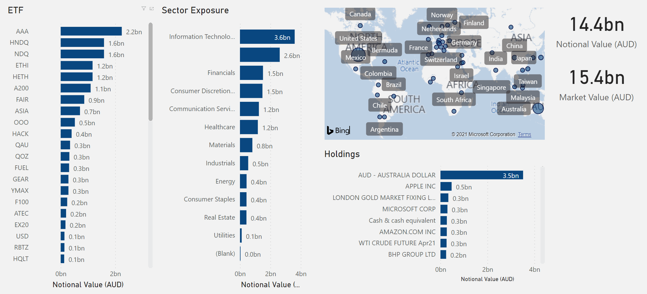
It was a great opportunity to get on the Equity Mates segment for ausbiz earlier this week and talk about all things ETFs with Alec and Bryce. In this episode we got to chat about ETF holdings as well as where are some good apps and data on ETFs. Whilst we covered quite a bit more than I normally get to talk about on ausbiz, I thought I should write this article to cover it in a bit more detail and also go over things we didn't get to go through on the show. HOLDINGS In the first half of the episode we looked at ETF holdings. To begin with what they are, they relate to what goes inside the ETF and these can be in the form of equities, bonds, options, indexes and more. ETF issuers will publish the data that goes into their holdings on their websites (and typically update them each day). There are also publishers who showcase what these holdings are in a variety of formats. Holdings are important because they let you know what the ETF is all about. Despite what an ETF might say on the cover, you should not only choose it just because of how it sounds. If you're after exposure to certain themes or you want to know how much weight a certain stock has in an ETF, you look at the holdings. If you want to know how much of an exposure an ETF has to certain sectors or geographic regions, you look at holdings. On the show we spoke about some analysis I did on BetaShares holdings (with data as of 26th February). For ETFs where holdings data was shown I could do this type of analysis which shows the global spread of BetaShares holdings with dot size based on how big the notional value is ($14.4 billion in total / $15.4 billion market value). This is based on equities and other securities which have geography tagged so it does miss a few things but we do get a pretty clear picture of the range of coverage here. It's quite wide. Having the holdings data like this also allows for the ability to do somethign more interactive like clicking on different ETFs to see what sectors they're exposed to, across which geographies and also see what equities are in those holdings (all shown in this case by notional value). NB: We'll be adding some apps that explore ETF holdings in the future. Only done BetaShares stuff for now. This data is available by most issuers to download so analysis is easy once you've pieced it together but for those wanting to get a shortcut to this, they can look at apps that provide this information such as ETF Logic which we talk about later on. Looking at holdings is important because you can protect yourself against various sorts of concentration risk which goes against the mantra of diversification benefits. When your ETFs are concentrated (either within the single ETF or across ETFs) you run the risk of amplifying your losses. There are a few ways this might occur, including: Correlation - looking at what is in the basket of holdings within your ETF is one thing, seeing how correlated their share price performances are is another. If you find there is strong correlation then what happens to one is likely to happen to another. Recently we saw a technology sell-off and stocks with high levels of correlation (or beta) did poorly as well. Exposure to poor performing themes - as mentioned above, stocks exposed to technology sectors did poorly recently with many sold off as global bond yields showed signs of increasing. If a lot of yuor ETFs have technology stocks in them, you're likely going to be affected by this exposure. Ways to tackle this would be to ensure you're aware of what's under the hood when it comes to ETF holdings and you can do that by being aware of some of the apps and datasets that are out there. APPS and DATASETS In this second part of the show we looked at the various ways investors can get educated about ETFs and where they can trade them. Below is some of the list I went through. It's not exhaustive but does cover a good amount that will get you started. The following links are a mix of both Austrailan and globally focused insights that I've split across a range of categoreis depending on what tickles your fancy. Reading (getting started) ASX ETFs course - www2.asx.com.au/investors/investment-tools-and-resources/online-courses/etfs-course Investopedia - www.investopedia.com/terms/e/etf.asp ETF Issuer publications/courses (e.g. BetaShares Education Centre - www.betashares.com.au/education/, Vanguard - How to get started - www.vanguard.com.au/personal/education-centre/en/insights-article/etfs-how-to-get-started) Reading (news updates) Whilst not all of these are Australian focused, for global ETF investors these are some great sites to be aware of Australian Financial Review - www.afr.com Livewire Markets - www.livewiremarkets.com Wall Street Journal - www.wsj.com Financial Times - www.ft.com ETF Stream - www.etfstream.com/tags/australia ETF Trends - www.etftrends.com ETFGI - etfgi.com Podcasts (look these up on Spotify, Apple or other podcast places) ETF Edge by CNBC Australian Finance Podcast History of ETFs on Bloomberg ETF Spotlight There's also this one from ETF Logic that's available on its site Speaking Logically - www.etflogic.io/podcast/ Watch ausbiz - www.ausbiz.com.au Equity Mates on ausbiz - www.ausbiz.com.au/topic/markets/equity-mates-on-ausbiz?topicID=212 New Money - www.youtube.com/watch?v=acZ4vqjLZe0&ab_channel=NewMoney Tracey Edwards - www.youtube.com/watch?v=uLEOcoD-nL8&t=75s&ab_channel=TraceyEdwards Investing with Rose - www.youtube.com/watch?v=vGcOGYkttI4&ab_channel=InvestingWithRose Data ASX - www2.asx.com.au/issuers/investment-products/asx-funds-statistics Chi-X - www.chi-x.com.au/funds/monthly-reports Yahoo Finance - au.finance.yahoo.com/ (and search for your ETF) Market Index - www.marketindex.com.au There are also datasets available from major market data providers like Bloomberg, IRESS, Factset, Morningstar, Refinitiv. ETF Apps ETF Logic - www.etflogic.io/ ETF Database - www.etfdb.com ETFtracker – www.etftracker.com.au (this site) Koyfin - www.koyfin.com Investing CommSec (or CommSec Pocket) nabtrde ANZ Bell Direct Stockspot Pearler Raiz Superhero Selfwealth Tracking If you're after tools to do portfolio tracking you can do this within those apps you see above but also you could download the data from Yahoo Finance or use Google Sheets to harness Google Finance data. For Yahoo Finance you could simply use their portfolio tools online to create and keep an eye on your portfolio or you could download the various set of information you need into Excel and do analysis from there. For Google Finance afficionados, you can check out this spreadsheet below. Make sure you make a copy and save it as your own as the owner won't respond to requests for access https://docs.google.com/spreadsheets/d/1Ajox_mGj_prTqfIWSSF1xcaDEBm6ZuZZDInZ1Es-_bM/edit#gid=4
- ausbiz / Equity Mates and talking about ETF Resources
Appearance on Equity Mates broadcast as part of ausbiz. In this show we looked at various ETF resources including where to get data and some other apps where ETF analysis is available. ETF apps and resources are on this site under the Resources menu. Video Links: https://www.ausbiz.com.au/media/all-you-need-to-know-on-etfs-and-how-to-make-the-most-of-the-sector-equity-mates-?videoId=7672 and on YouTube here:
- It's getting hot in here... and heatmaps just won't do
Time for an update Whilst we’re still early in the new year, the ideas I had to refresh the ETFtracker app were still fresh in my head. As a reminder, we have 4 key areas of the app: Dashboard Analytics Single ETF view Data Stories Analytics lets you look at the various metrics produced by ASX and Chi-X historically in an interactive way across different sub-menus. Single ETF View pulls multiple metrics together onto one page to give you an overall ETF snapshot. Data Stories is a semi-interactive look at some key stories coming out from the ETF data each month. The Dashboard section needed an overhaul though. It showed some bar charts with rankings of spreads and net inflows. It had a scatter chart for 1-month vs 1-year price returns. It also had 2x line charts showing number of trades each month and the number of Funds/ETFs listed on both exchanges. Whilst there was some filtering that users could do the big limitation was that, for a dashboard, it was not really a dashboard. Putting our data analytics hat on for a second we know that dashboards are meant to convey some simple key messages and display them in an easily digestable way. The best dashboards contain data and charts that need little to no explanation. For ETFtracker to be even more useful and insightful it needs some help. Enter the heatmaps So the solution to this was to look to the past and what I used to produce when I was doing my macroeconomic dashboard at QMG (QuantMetriks Global). One of the key mainstays of our monthly analysis there was a heatmap. It was an easy way to use colours to showcase the different industries and sectors we covered and what was doing good or bad in terms of metrics like Sales, Margins, Price, Volumes and more. Heatmaps are great as they are commonly seen and understood in finance but they have their limits. For example, looking at the following heatmap from Finviz.com, we can see that they only give a snapshot at a point in time of what is going good and bad across a basket of stocks, sectors or industries. They only tell you what is going on right now without conveying the message about what has happened in the past (or if you forecast, what could happen in the future). The data consultancy, Storytelling with Data, have a good post on the limitations of heatmaps here “a heatmap makeover”. They suggest some ways to more fully visualize the data. Bar chart with trendline One suggestion is to include a bar chart which ranks what is good and bad along with an accompanying time series chart that reflects the selection. This is good but does require good labelling and for users to click on each bar to highlight the related time series. Small Multiples / Multiple trendlines Another option is to do a small multiples style chart which shows major categories broken out as a number of individual time series charts. When done with some colour, this is a great way showcase what’s happening now as well as what the trend has been in the past. Experimenting with our own updates Putting all this together, I am currently experimenting with a dashboard revamp using a mix of the best of both worlds. The colour from the heatmaps to show a snapshot of what is good and bad and the small multiples approach to showcase trends. There are a number of ways we could do this but we’ll start by looking at the different categories that the exchanges define. There are a lot of them so I’ve grouped similar ones together like the various domestic equity sectors. They just sit under the banner of Equity – Australia. All the other global equity related ones are grouped under Equity – Global. Doing this got us down to 13 categories so to get an even number we’ve cut the various Index related ETFs. The trends on their own only show part of the story. We needed some metrics as well as to say whether or not the latest month is good or bad. Simple background shading shows whether the metric for a particular ETF category is good or bad. This change isn’t deployed into the app just yet but here’s how things like for January 2021 for a measure like Net Inflows. In the following chart, we can see a sea of green as all categories had positive overall net inflows even though going from December 2020 to January 2021 there were some declining trends. Contrasting this with the same view in March 2020 and we get a different picture. With the market rife with uncertainty we saw a more outflows than inflows and more red measures in the mix. There are some areas to improve including ensuring a similar Y-axis across the trends otherwise different categories are not easily comparable. This works with total price returns for ETFs (see below) but with the ASX:MGOC listing in November 2020 it skews all the other categories if we align their Y-axis. So, there's still some thinking and work to do before deploying them. Anyway, what do you think about all this? Do you like this idea of displaying the data and do you see ways to use it even in your own data analysis? Stay tuned here for more ETF market updates. PS: the Finviz.com site is awesome as it does display some pretty cool interactivity as you hover over each heatmap element. It interactively shows you consittuents and trends so they've done well with that and it is something that can be done with ETFtracker too but we'll save that for a later date.
- Market Flash Note
Testing out a new kind of ETF market flash note and doing this for the latest January 2021 data that came out last week. It's designed to be something we can update and push out to market quickly but we will still do the more in-depth detailed analysis for the month and publish it here. Check out the slides below:
- Market Update - January 2021
With new market statistic out from the ASX we can see that ETF funds under management in Australia continued on its upward trajectory to now sit at $96 billion as at the end of January 2021. At this rate we would expect $100 billion to be hit by March/April, a significant milestone for Australian ETFs. This growth has been pushed up by the Magellan Global Fund Open Class ETF (MGOC) which was added in November last year along with its $12bn worth of holdings at the time. Some may argue that this artificially inflates the market but even if you take that out, the market grew to $82 billion which is not an insignificant amount if you look at where we were in previous years (end of Jan 2018 was $36.2 billon, Jan 2019 was $42.3 billion, Jan 2020 was $65.7 billion). The dip experienced in March has more than recovered and ETFs are growing strength to strength. Another area often looked at is Net Inflows and in January we saw VAS, IOZ and NDQ make up the top 3 ETFs. This is typical as these funds often make up what is part of the "core" of a core/satellite type portfolio that many investors go for. So it's not unusual to see them at the top. In the rest of the top 10 there were some notable performers from the ESG space. ETHI and FAIR (both from BetaShares) had $59 million and $36 million of inflows in the month and this showcases the continued growth and popularity of ESG related ETFs. ETHI tracks the Nasdaq Future Global Sustainability Leaders Index which has a number of household names in its holdings base. These include Apple, nVidia, Tesla and Paypal for example. Tesla is interesting because at one point in time - end of 2019/early 2020 - it was ranked highly on ESG ratings by index provider MSCI but on the FTSE ESG ratings it was lower. ESG does depend on how holdings are being screened, either exclusionary (avoiding certain sectors or stocks) or postively (highlighting leaders in specific ESG related areas). What's important is for investors to look at underlying holdings which they can typically do through the PCF (portfolio composition files) updated regularly by ETF issuers. They can also subscribe to the abundance of materials provided by ETF issuers each week, month quarter. There is a tonne of information out there. For more on ESG and how it performed in 2020, check out our article here: The Rise of ESG Investing in Australian ETFs. Next we jump to total returns and according to the exchange data, the overall market was only slightly up in January at 0.4%. The best performing area (based on thematics) was technology and out of the bunch we saw BetaShares again take top billing with its Asia Technology Tigers (ASIA) ETF. ASIA consists of some well-known names that even Western investors may be aware of. This includes JD.com (ecommerce), Baidu (search engine), Alibaba (world's largest retailer), Tencent (social media), Samsung (electronics) and Taiwan Semiconductor (you can guess what they do). Most of these names saw positive performances in January and are up YTD (Alibaba is up +17% at the time of writing). The largest holding in ASIA is Taiwan Semiconductor which just saw news come out that it struck a deal with Apple to create mini OLED screens for AR (augmented reality) devices. The chart below was created by taking a look at the January performance of the technology themed ETFs and we can see that ASIA was a turnaround story in a way. It typically lagged the other ETFs at the beginning of each year but 2021 sees it off to a flying start. We'll see how it keeps up the pace going forward. For insights on how to use the app check out the Using the App section on the blog. Also, you can access the main ETFtracker App which we update each month in the Apps section on this site. If you're on your phone you can only see the mobile friendly app which has less features so hop on to your desktop to see more. You might also notice the New Era Analytics logo at the top of the charts here. That's my new company that I just started this week that will house and update/maintain the ETFtracker app and site. You can learn more about it here: https://www.neweraanalytics.com.au/post/welcome-to-a-new-era-analytics. If you have any questions or want to talk about any of the above then feel free to get in touch. Happy trading!
- ausbiz - January 2021 ETF Update
Highlights included the continued growth of FUM for Australian traded ETFs, now at $96 billion. We also looked best performances for first month of 2021 and Technology and ASIA (BetaShares) topped the charts. More details in the blog: https://www.etftracker.com.au/post/market-update-january-2021 Video Link: https://www.ausbiz.com.au/media/its-time-to-enter-the-100b-etf-market-?videoId=7041