UPDATE: As of July 2021, the ETFtracker has been updated to a new format - to see how the new app works you can check out the following App Guide videos on Youtube: https://www.youtube.com/watch?v=AbRHrqsgFjE&list=PLjC6E9VHX9Hh7Fa8Csa2hlWJmLVcONo01&ab_channel=ETFtracker and this article in the blog: https://www.etftracker.com.au/post/etf-app-features-and-new-videos-coming
In this article we show you how you what's in the Analytics section of the ETFtracker application.
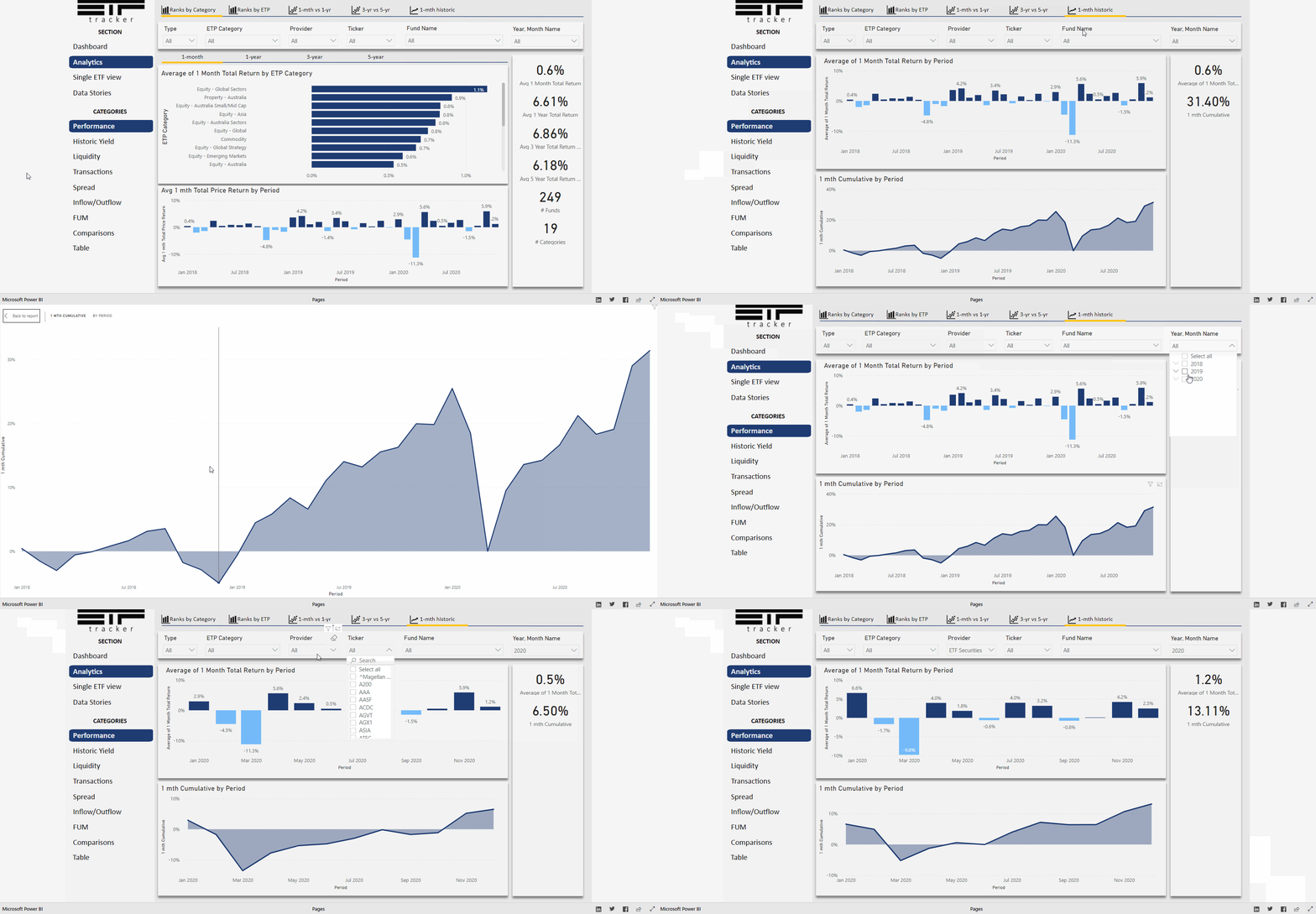
Once a user is in the app, they can move to the Analytics section using the menu options on the left hand side. The Analytics section was built to make in-depth analysis of the monthly ETF data more visual and interactive than having to pour through multiple Excel/PDF files for answers.
This section has a variety of sub-categories relating to
Performance
Historic Yield
Liquidity
Transactions
Spread
Inflow/Outflow
FUM
Comparisons
Table
Each section takes data from the ASX/Chi-X reportes and shows different views of this data via separate charts and sub-sections.
In the example below we can see a user look at performance and different sub-menu views. They also click on some of the filters to change what's on the page and can even expand on charts to see them in more detail.

