As we mentioned last month, we were working on an update to the ETFtracker app after having this currernt version out for over 12 months. Despite comign out a little bit later than we expected to release it, we're finally here and we'll begin by taking a look at a list of the updates.
If you want to jump straight to the app you can go to the Apps section on this site or scroll down to the end of this article.
So what's been updated?
Overall look and feel
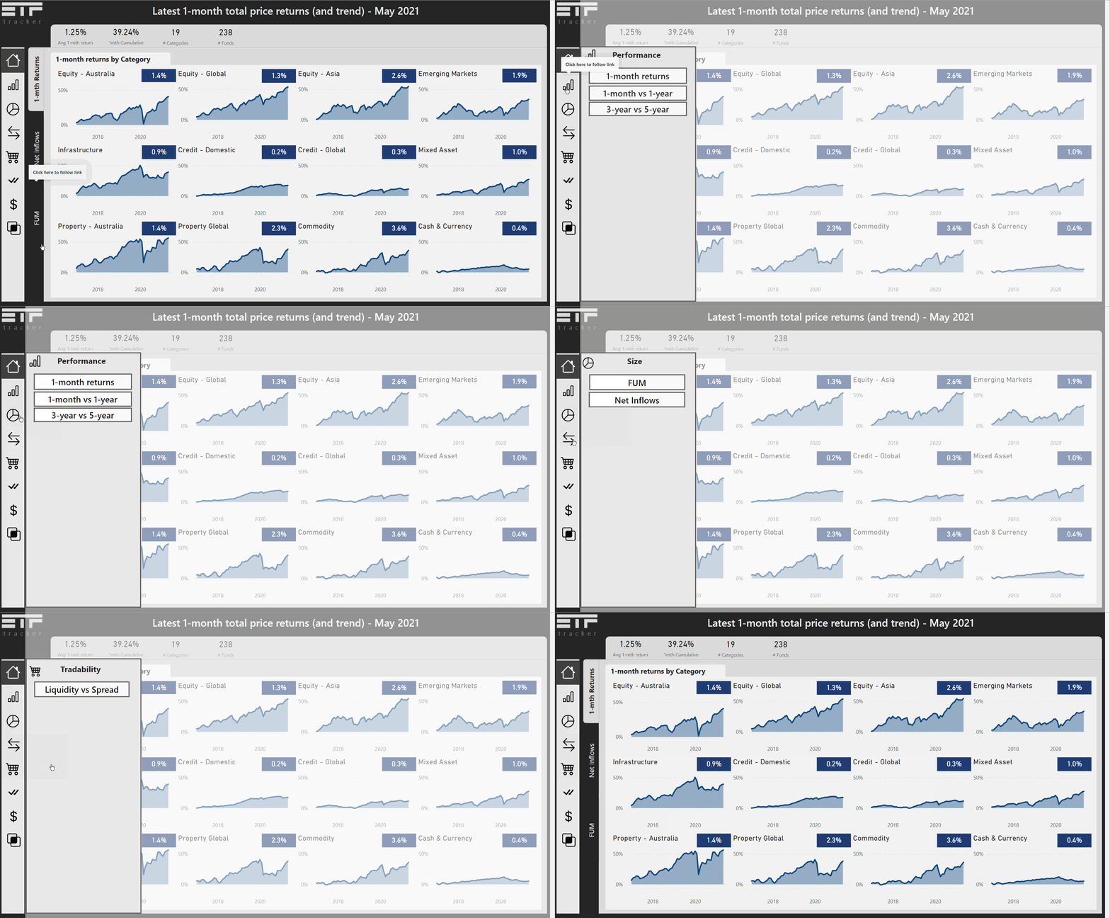
Firstly, we have updated the overall look and feel of the app to this new app including the overall aesthetic and design. The last app took up a lot of space in terms of how we layed out the menus and sub-menus as well as filters on the page. With the filters at the top of the page in that app, there was a limit to how much could be added to them so it meant that if new interesting ways to filter the data became available, something would have to be removed from the top row. The same can be said for the menus with the main menu down the side taking up space and having sub-menus at the top of the page as well.
In this new version we make use of the app we take advantage of menu popouts which, for navigation, are on the left and for filters, are on the right. This way of doing things means that as new features are added to the app we don't have to do a hard redesign to try to find a place to fit things on the page.
All of this leads to being able to give more space to the charts we show on a page.
Old - Main menus and multiple sub-menus

New - Hidden menus and popouts

Old - Filters at top of page and limited space

New - Filters also popout now and there's more screen real estate to display or add to this

Old - Size of other items like main menus and KPIs on the sides and filters and sub-menus at the top means less screen real estate for charts

New - more screen real estate available with compressed menus and filters

New way to switch view and the addition of ETF themes
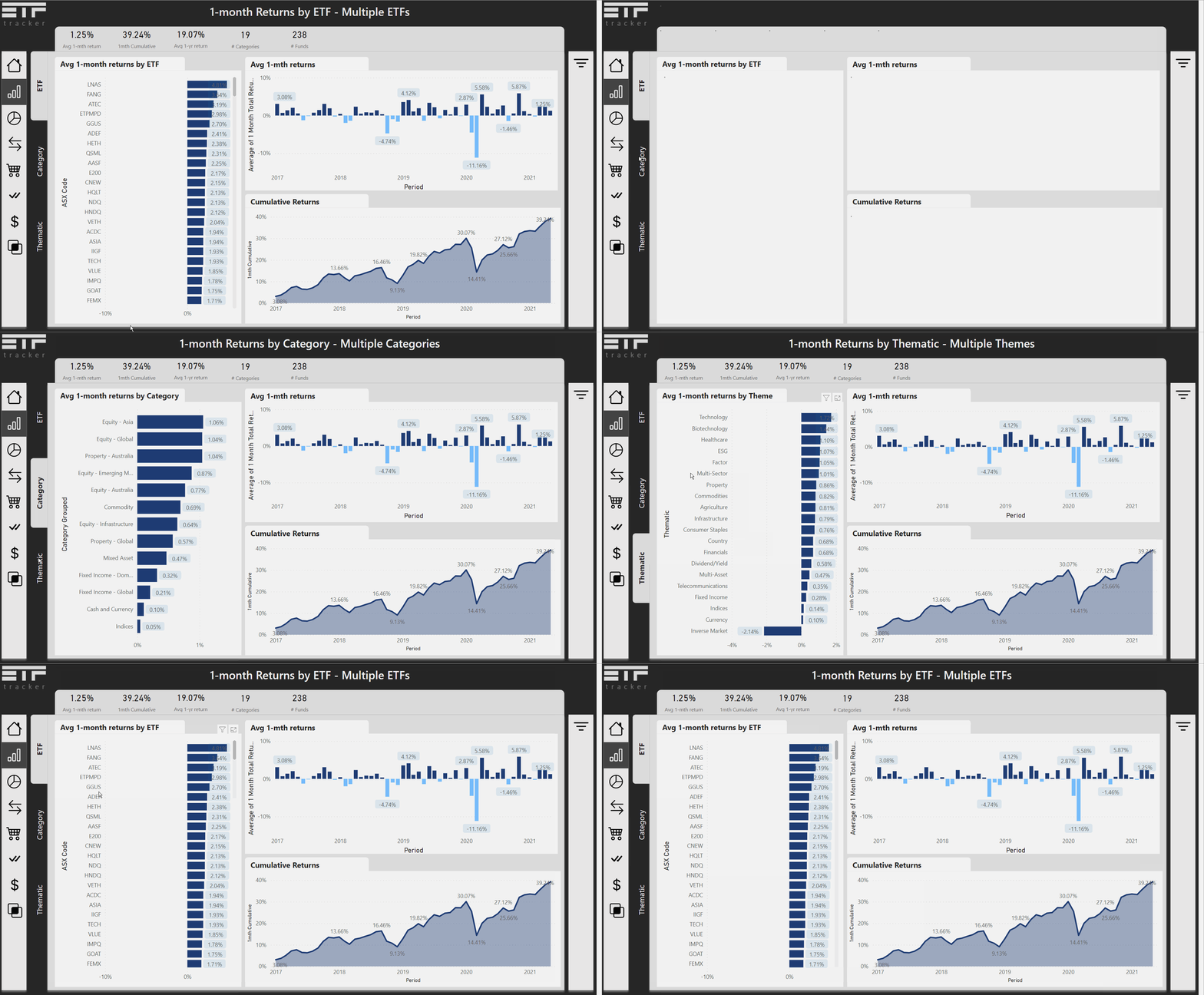
Additionally, we made it easier to view the data by ETF or other groupings (ETF category and Themes). Each metric can be filtered this way using the sub-menu option on the left hand side.
New side panel enabling a switching of views

The themes view is new and is something we created when trying to do our own analysis of what was going on for particular groupings of ETFs. The ASX already provides their own categories but there were some things it did not necessarily capture. For example, if we wanted to look at technology focused ETFs or ESG themeed ETFs, these were not available. Since we created our own groupings of these for our own analysis (and for various articles we'd written) it was a feature that was begging to be added to the app.
The different theme groups are as follows:
Agriculture
Biotechnology
Commodities
Consumer Staples
Country
Currency
Dividend/Yield
ESG
Factor
Financials
Fixed Income
Healthcare
Indices
Infrastructure
Inverse Market
Multi-Asset
Multi-Sector
Property
Technology
Telecommunications
These may change over time as some, like multi-sector include quite a few ETFs in them.
Organised metrics
The last app showcased quite a few different metrics that come from the ASX/Chi-X each month but these were not organised in a defined way. Performance metrics were shown at the start since many people ask about those first but the layout was not adapted into different categories. This is unlike when you do any sort of securities analysis and want to look at the size of an ETF or its tradability via how much liquidity it has versus its % spread. The new app now takes these into account and has organised the data into the following areas
Performance
Size
Transactions
Tradabiltiy
Quality/Yield
Costs
Some of these new menu sections have a few metrics and options to them whereas others have only 1 option but these can be added to in future.
Adding ETF descriptions
In the previous app, we showcased the data in an interactive way but if a user was interested in the ETF, they' have to go elsewhere to read about it. Whilst we don't have all the info for the ETF, at least now users can get a quick description of what the ETF does.
This is delivered when users hover over any bar chart that showcases ETFs.
Hover over reveals ETF descriptions

Drill-through capabilities
In addition to the hover overs, you can also view individual ETFs on their own by right clicking on an ETF you see labelled in a bar chart or on a scatter plot. When you do this you will get the following list and selecting drill through shows that there is a page called Individual.

Clicking on this takes the user to an individual ETF analysis page where they can view different metrics all on a single page for that ETF and navigation at the top left takes the user back to the previous page they were on.

This drill-through capability only works on pages where ETFs are shown, not categories or themes.
Compressed chart layouts
This app still has a lot of data and options to it but before we split things out into single pages for metrics that should likely have been grouped. This included having a separate page for 1-month, 1-year, 3-year and 5-year total returns and more.
Now for these metrics we group them together and removed the need for showcasing a monthly time-series which featured the changing nature of 1, 3 or 5-year returns which was not that useful. Now, the scatter chart display has been kept from the previous app along with the bar chart ranks.
Link to the app
The new app is available here: https://www.etftracker.com.au/the-app
Check it out and let us know what you think.
Moving forward / Product roadmap
ETFtracker is a labour of love product, so any work that is done on this is done so in our own spare time away from our paid for projects. That said, where we do find time we'll be working on the following updates:
Integrating holdings analysis - we already have the various holdings analysis apps (see the Apps menu dropdown) and will be looking to bring at least some of this information over to the main ETFtracker app
Updated Data Stories - we had this as a part of the old app but it got to the point where the stories were becoming less and less dynamic. We're searching for new ways to make compelling data stories and may even create these in their own separate application. Time will tell.
Calculators - one requested item has been to add some simple portfolio calculators to the app and some scenario analysis tools that allow users to check what performance returns could hypothetically have been. Well, its on the list for future features.
And More to be announced later
If you have ideas for things you'd like to see please shoot us a message.
Happy investing folks!
